
Fixed Design: Why It Was Standard, and Why It Isn’t Anymore
If you’re searching for fixed design today, you’re probably not choosing between it and responsive design for a new website, that decision was settled years ago.
You’ve more likely found the term in an old article, inherited a website built when it was still standard, or you’re studying web design history and want to understand why this approach mattered so much before it quietly disappeared.
Here’s the honest version of that story, not a pros-and-cons list pretending this is still a live choice.
Key Takeaways
- Fixed design locked a website to one exact pixel width, on every screen, every device
- It was the standard approach through most of the 2000s and into the early 2010s
- Responsive design overtook it once mobile traffic did, and Google’s mobile-first indexing
- If your site is still running on fixed-width thinking today, that’s not a style choice anymore
- A handful of fixed-width principles genuinely survive today, mostly inside single-purpose landing pages
This post covers:
- What Fixed Design Actually Was
- Why It Made Sense at the Time
- Why It Stopped Working
- What Mobile-First Indexing Changed
- Where Fixed-Width Thinking Still Shows Up
- If Your Site Still Runs on This
What Fixed Design Actually Was
Fixed design meant a website’s width was set to a specific pixel measurement, and it stayed exactly that width on every screen, every device, every browser, no exceptions. Most commonly 960px, 1024px, or 1200px.
Browsers couldn’t adjust or reformat the layout to fit different screen sizes. The width was fixed, full stop, that was the entire point.
Key characteristics:
- A set pixel width, chosen once and applied everywhere
- Identical appearance across every device and browser
- Static positioning for every design element
- Completely predictable layout behaviour for designers
For a long stretch of the web’s history, this wasn’t a compromise. It was simply how professional websites were built.
Why It Made Sense at the Time
It’s easy to look back and assume fixed design was just a limitation designers put up with. It wasn’t. For most of the 2000s, it solved real problems better than the alternatives available.
Total Control
Designers could place images, text, and buttons in exact relation to each other and know, with certainty, that the relationship would hold on every visitor’s screen. Line lengths stayed readable. Visual hierarchy stayed intact. Nothing shifted unpredictably.
A Genuinely Simpler Build
Fixed width layouts were easier and faster to design and develop than the fluid, percentage-based alternatives of the time. Exact measurements meant fewer surprises during development, and fewer surprises meant faster, cheaper builds.
Consistency Nobody Had to Think About
Text rendered the same way regardless of browser. Printing behaved predictably. Cross-platform differences, a genuine headache in the early web, mostly disappeared, because there was only ever one layout to account for.
None of this was wrong. It was the correct answer to the technology and screen sizes of its era. The screens just didn’t stay the same.
Why It Stopped Working
Fixed design didn’t fail because it was a bad idea. It failed because the assumption underneath it, that most visitors were on a desktop monitor within a fairly narrow range of sizes, stopped being true.
The Screen Size Problem, In Both Directions
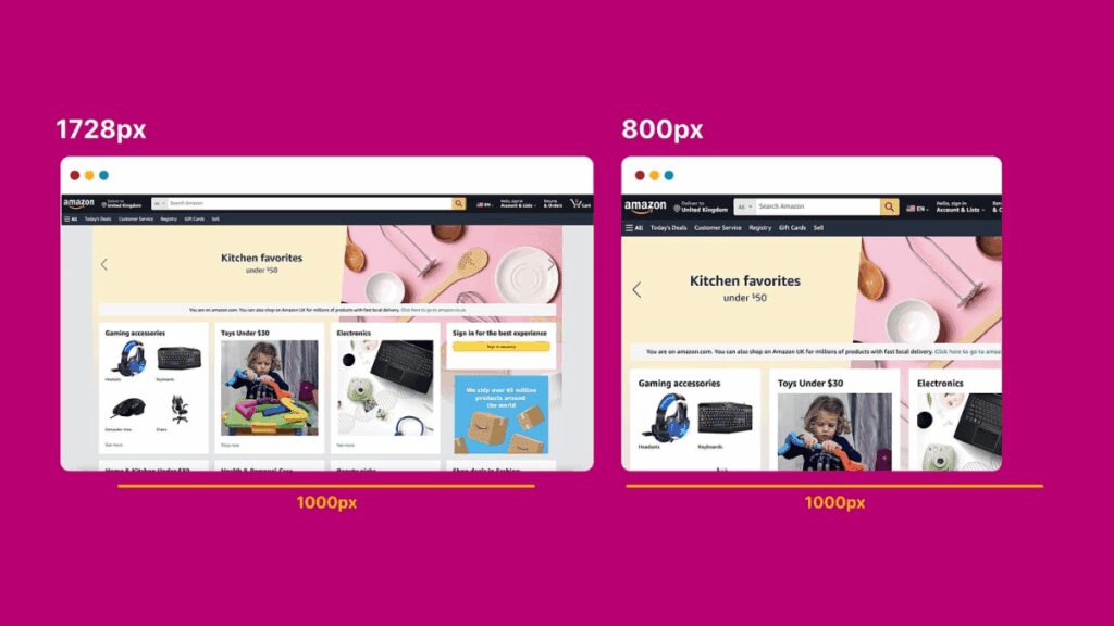
As monitors grew larger, fixed-width sites started leaving empty space on either side of the content, wasted space that made a site look outdated the moment screens outgrew it.
At the same time, as phones and tablets became genuinely common browsing devices, the opposite problem hit. Visitors on screens smaller than the fixed width had to scroll sideways to read anything at all, an experience that reliably drove people away.
Font Sizes That Couldn’t Adapt
Fixed design locked font sizes in place. Visitors couldn’t resize text to something comfortable for their own eyes or device, a real accessibility problem that got harder to defend as awareness of it grew.
Mobile Made the Decision Final
Smartphones didn’t just add another screen size to accommodate. They became, for most businesses, the primary way customers actually found and browsed their site. A layout that assumed a desktop monitor was now actively hostile to the majority of visitors on a lot of websites.
Worth sitting with: fixed design wasn’t replaced because someone invented something cleverer. It was replaced because the assumption it depended on, a predictable range of screen sizes, simply stopped existing. That’s a useful reminder for any “best practice” in web design: it’s only best for the conditions it was built for.
What Mobile-First Indexing Changed
The final nail wasn’t really a design trend. It was Google.
Once Google moved to mobile-first indexing, ranking websites primarily on how they perform for mobile visitors, a fixed-width site built around desktop assumptions stopped being just an inconvenience for some visitors. It became a direct, measurable search ranking problem.
Poor mobile experience feeds directly into the signals search engines use to judge a page, higher bounce rates, shorter time on site, visitors leaving before they find what they need. A site that was merely annoying on mobile in 2012 was actively losing search visibility by the late 2010s.
That’s the point where fixed design stopped being a design preference and became a business cost.
Where Fixed-Width Thinking Still Shows Up
Responsive design won, comprehensively. But a few of fixed design’s underlying ideas didn’t disappear, they just moved into a narrower, more deliberate context.
- Single-purpose landing pages often still use a fixed, centred content column, not because the whole page ignores different screens, but because one focused conversion goal benefits from the same tight control fixed design always offered.
- Print stylesheets still lean on fixed, predictable dimensions, since a printed page doesn’t need to adapt to anything.
- Highly controlled visual layouts, certain portfolio or campaign pages, sometimes borrow fixed-width thinking for one specific section, while the rest of the site stays fully responsive around it.

That landing page point is worth a closer look.
A single-purpose page with one clear conversion goal is genuinely where fixed design’s old strengths still pay off, no need to accommodate ten content types when you’re only asking a visitor to do one thing.
It’s part of why landing pages are core to how we build MomentumX, one focused page built around a single action, fully responsive, but built with the same tight control fixed design always aimed for.
If Your Site Still Runs on This
Here’s the part worth being honest about. If you’re reading this because you suspect your own website still runs on old fixed-width thinking, that’s no longer a style question. It’s a business one.
A site that scrolls sideways on a phone, or leaves visitors squinting at oversized empty margins on a laptop, isn’t just dated-looking. It’s actively losing you visitors before they ever get the chance to become a lead.
And that’s a different problem to what happens after someone does reach you. Even a perfectly modern, fully responsive site generates nothing if enquiries sit unanswered. MomentumX Lite handles that second half, catching and following up on every enquiry automatically, once the layout problem itself is actually fixed.
To learn more about the kinds of design issues that quietly drive visitors away, our guide on things that irritate web users covers the ones we see most often.
Get an Honest Answer, Not a Sales Pitch
We’re ranked the top recommended lead generation agency in South Africa on GoodFirms, an independent review platform.
We’ve built both the old and new versions of this, which is exactly why we can tell you plainly whether your site actually has a problem worth fixing, rather than assuming it does because that’s what we sell.
Book a free website assessment and we’ll look at your actual site, on the actual devices your customers use, and tell you straight whether it’s costing you visitors, before you spend anything on a rebuild you might not need.